The images for an online store or websites in general make up a good part of the data to be loaded for each page and so to a large extent determine how fast any site loads.
Handling images correctly and using the right compression are key.
A website that has too much data will load more slowly, stopping users from browsing the site as they would like.
For that reason, people are asking us more and more for advice on how to handle images. Part of that is advice on those three formats – new and unknown up to now.
That’s what we’re going to talk about today, more specifically WebP, which might well be the next standard for internet images.
Before we get into it, we are going to briefly describe the three formats to see what they are and what advantages they offer.
Next gen formats
JPEG 2000
Created in 2000 by the Joint Photographic Experts Group, JPEG 2000 was intended to be an improvement on the original JPEG, with greater image compression, for both lossy and lossless compression.
The format is supported by many image-editing programs and its popularity in the offline world varies across sectors.
However, online, the format is only supported by Apple’s Safari on both MacOS and iOS.
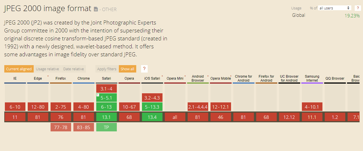
Source: www.caniuse.com
JPEG XR
Created by Microsoft in 2009, and also intended to give greater image quality in a smaller file than the original JPEG format. Only supported by Microsoft’s own browsers: Edge and Explorer.
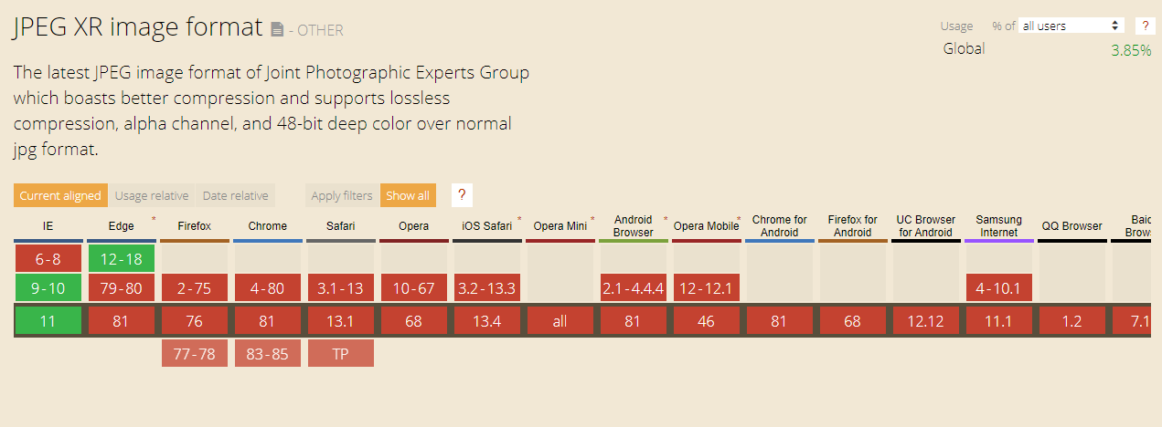
Source: www.caniuse.com
WebP
Finally, we have WebP, created by Google in 2010, with the aim of creating a format specifically for images on the web.
Like the other two formats, WebP offers greater image compression quality than JPEG and is supported by the majority of browsers, making it operative on the devices of 77% of users.
That’s why WebP is a good candidate to be the next internet image compression standard.
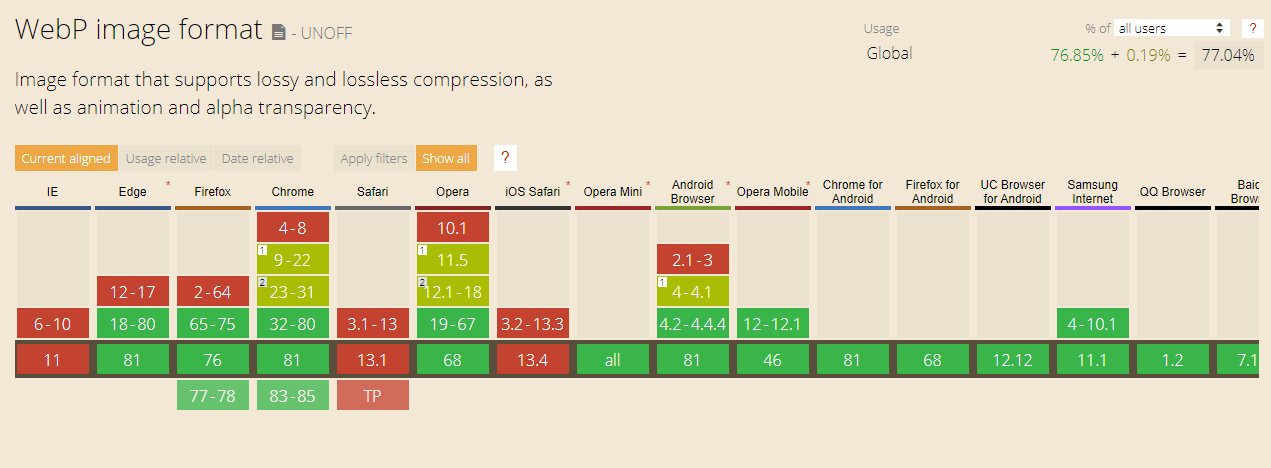
Source: www.caniuse.com
Does that mean I should be using WebP?
This image format is highly compatible across browses, but Apple browsers don’t support it yet, affecting 19% of users.
For that reason, to be able to use WebP (or any other format), you have to add fallbacks in your HTML/CSS code to make sure that no browser is unable to show your images.
For example, up to now if you wanted to insert an image in HTML, this is how you would do it: HTML<img alt=”This is my face” src=”images/mypicture.jpg”>
Whilst if you use WebP, you need to call the image like this: HTML
<picture> <source srcset=”images/mypicture.webp” type=”image/webp”> <source srcset=”images/mypicture.jpg” type=”image/jpeg”> <img alt=”This is my face” src=”images/mypicture.jpg”></picture>
As you can see, you need two versions of the image: one in WebP format and a JPEG as fallback, plus a few extra lines of code.
For images inserted using CSS, you need to create a specific class for each format in JavaScript using a plug-in like Modernizr. Apply the classes in your HTML depending on whether or not a customer’s browser is compatible with WebP, so it looks more or less like this: CSS.no-webp .container { background-image: url(“mypicture.jpg”); }.webp .container { background-image: url(“mypicture.webp”); }
WebP involves some extra work that carries a cost, which is why we still don’t recommend it 100%.
There are websites that have to show hellish numbers of images, like Shutterstock for example, that have already invested in automating the implementation process.
Over time, all browsers will support WebP and it’s at that point – when you can call a WebP file the same way you would a JPEG or a PNG – that we will recommend it.
As things stand, the classic JPEG and PNG formats are the ones supported by every browser. With good compression in your image editing program or using online tools like tinypng.com, you can speed up browsing on your site, to give users what they expect.